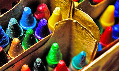
Melted Crayon Creativity!

crayon art

Crayons have long been the go-to art utensil for children around the world. You probably have childhood memories of an open notebook and crayons spread out over a table in no particular way, laying exactly where you threw them down to hurriedly grab another and another. And maybe you even have children or nieces and nephews that bestow you with their masterpieces of scribbled color. The excited frenzy that you see in the art of children and once felt yourself can be relived in a unique DIY crayon art design!


This project is not your typical crayon design on coloring book pages, but rather a more adult version that harnesses the playful energy and creativity of crayons.


What you will need: canvas (any size), basic paint set and paint brush, Crayola crayons, blow dryer

Follow the steps below to create a modern color splash design with crayons!


  1. Gather Materials – Decide on the size of canvas you want, depending on where you plan to hang the finished piece. The size of canvas will be a good indicator of how many crayons you will need; you want to try to cover at least 50% of the canvas with color. The paint can help fill the empty spaces and add to the design, but don’t rely on the paint to be the focus point.


  1. Decide on an Image – Your piece should have a cohesive idea. The idea could be as simple as a color pallette or as complex as an image, such as a tree. Decide where in your image you will incorporate splashes of crayon color. For a tree, the crayon splashes could be groups of leaves – great for the changing fall colors look!


  1. Melt Crayons – Unwrap the crayons you have chosen. Using a fork or tweezers, hold out the crayon over the canvas. Turn the blow dryer on the highest heat and point it downward over the crayon and toward the canvas. As the crayon melts, the color will splash across the canvas. Repeat this with several dozen crayons of varying colors. The splashes can be isolated or overlapping.


  1. Add a Splash of Paint – This is the step that pulls the whole idea and image together. Did you imagine the color splashes as groups of tree leaves? Then add brown paint extending down from them like a tree trunk. If you were just experimenting with isolated splashes of color, you could add green stems and turn them into abstract flowers. Or just play around with paint shapes and outlines over the top of the crayon splashes for a more modern graphic look!


  1. Finish – The crayons must cool in order for the color splashes to harden into place. The paint must also dry. Once enough time has passed, you may choose to add a spray finish to keep the colors from running or smudging further.


Have you been looking for a simple art project for Sunday afternoon? Or maybe you need to dress up your apartment for a showing? This DIY melted crayon design is a fun solution to suit your boredom and decoration needs! And best of all, it’s inexpensive and doesn’t take intensive art skill. Once you’ve finalized the piece and are ready to display it, head over to Frame Warehouse to choose the perfect finishing frame.
8 Rules of Photography Composition

photography tips

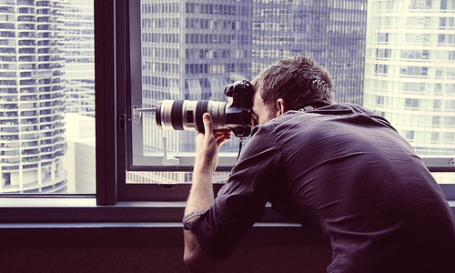
Now that you know the Basics of Photography, it’s time to talk about composition and maximizing the aesthetics of your photographs. Let’s face it – when the perfect moment arrives, whether it be sun rays passing through a misty forest or the smiles on children in a playground, it’s difficult to think about rules. All you want to do is snap a shot that conveys the same passion and inspiration you feel about the imagery. By mentally arranging photos using a set of broader guidelines, you can train your brain and eyes to naturally set up and take better photographs.


With that in mind, take a few shots using these eight basic “rules” of photographic composition:

  1. Background – Avoid clutter behind your subject. This doesn’t mean avoiding color or action. You can’t always control certain elements, and some actually add to your overall effect. However, simplicity is key when starting out. Consider changing positions or blurring the background with a closer lens focus.


  1. Patterns – Symmetry exists everywhere you look, and not all of it is man-made. Certain symmetry can provide intriguing composition, especially when the pattern is interrupted in a meaningful way. After all, the human mind follows patterns. In that way, it also notices and tries to analyze discrepancies.


  1. Rule of Thirds – Break your scene into thirds in both the horizontal and vertical directions with imaginary lines, creating nine sections of the photo. Set your composition up with the subject(s) along the lines and especially where the lines intersect. For some reason, filling these areas looks better in an image.


  1. Balance – The rule of thirds can be tricky when you have only one subject. You don’t want to leave the rest of your picture empty. There is no interest there. Instead, fill the background with a secondary subject. The rule of thirds will accent your primary subject and the composition will seem more balanced.


  1. Leading Lines – Diagonal or curvy lines made from objects or natural landmarks like rivers, mountain ranges, etc. can spice up a photo as well as lead your eyes into the image. When you utilize this rule, be sure that the lines are leading to a subject or some sort of conclusion.


  1. Viewpoint – Oftentimes an uninteresting subject matter can be transformed with a simple shift in viewpoint. Don’t be afraid to move around and take shots from alternate angles, especially changing the camera level. For instance, a photo of a statue or building from low to the ground can create a menacing or overwhelming feel.


  1. Framing – Another way to accent your subject is through composition framing. Try using trees, archways, window frames, etc. to draw the eye toward the main subject matter.


  1. Depth – Photography is a two-dimensional representation of a three-dimensional world. An actual scene may have a foreground, a middle ground, and a background. Convey this kind of depth by overlapping objects or setting similar objects at differing distances.

These rules are a great start to training your eyes and brain for better photographic composition, but remember that there are no real “rules.” In fact, many great artists have become great by breaking rules. Don’t be afraid to experiment and even purposefully ignore or do the opposite of any of these. It might just revolutionize modern photography!

When you’ve developed or downloaded your film, take your favorite shots into Frame Warehouse to finalize the collection!

Raised Letter Art

creative framing ideas

You may remember ABC blocks from your childhood, or perhaps your mother pulls out the photo album each year and shows you an embarrassing picture of yourself stacking them up to create nonsensical words. You have to admit that there was something altogether artistic about the look of stacked and arranged wooden letters, even if they didn’t make complete sense.

Well, now you once again have a chance to play with blocks – letter blocks, that is – and turn them into art! Of course, this time you will be arranging them into words, lyrics, and quotes that are meaningful to you. All you need for this DIY project are wooden letters (anywhere from ½” to 3” in height), canvas, glue, and some kind of paint.

Take these four steps and you’ll have a unique and meaningful 3D art piece in no time!


  1. Choose letters.

Any crafting store will have a variety of sizes and styles of wooden letters. Choose a size that is appropriate to your chosen canvas size. If you are creating a piece that is smaller than a few square feet, you probably don’t want letters over 1” tall. The smaller they are in proportion to the canvas, the more design options and longer quotes you will be able to accomplish.


  1. Plan a design.

This art project is a great opportunity to express your inner poet or simply quote your favorite movie line. In addition to the words used, you must also design the layout. Centered or offset to the side? Curving or perhaps slanting downward? You can even make unique shapes with the words! For instance, you could arrange words like “love,” “friendship,” “family,” “home,” etc. into the shape or outline of a heart.


  1. Paint letters and canvas.

Spray paint, acrylics, or even house paint will work for this project. The canvas and wooden letters need not be the same color. If they are, the art takes on an interesting ghost image effect. If not, the letters can really pop and create a 3D texture in the space.


  1. Place and glue letters.

Finally, after the letters and canvas dry, arrange the lyrics, quote, or word shape on the canvas itself. Then, you will want to turn the letters onto their “fronts” one by one and glue the backs with spray adhesive or wood glue. Turn them right-side up and press down onto the canvas. Once each individual letter is securely in place, you’re done!


One of the coolest aspects of this project is the way the wooden letters pop from the canvas and give it that 3D feel. The wrong frame can flatten the aesthetic look and turn your effort into a common word print. Don’t take that chance! Instead, bring your creation into Frame Warehouse and get expert advice from the framers who care just as much about your final work of art!

Framing Considerations

framing

You’ve struggled day and night to put your heart and soul into a project, be it a painting or photographic composition or a collage, and now you need a perfect frame. One option is to bring your artwork to a professional and hand the piece off. The framer can make all of the finishing touches to best display your piece. Or you can take a more hands-on approach. After all, isn’t the frame really a part of the art?

There are several key decisions that go into choosing a frame, and we aren’t just talking about color or design. When you take your artwork into a framework specialist like those at Frame Warehouse, prepare with these seven framing considerations:


  1. Ready-Made Frames – The primary decision you will have to make in framing a piece is whether or not to buy a ready-made frame. These frames are essentially already designed and created, so your artwork can be framed faster. They are also usually less expensive.


  1. Barrier Papers – Whether your artwork is a one-of-a-kind painting or a finger painting given to you by your 3-year-old, it holds value to you. Barrier papers offer an extra layer of protection from the elements like lignin and acid, helping preserve the life of your piece.


  1. Hinging – This is another method of framing to prevent potential damage to a piece, especially if it’s fragile. It allows the work to hang freely, expanding and contracting with changes in temperature or humidity.


  1. Mounting – Live in a humid environment? Prevent rippling and warping with a smooth, rigid mount. Special mounting board can even reduce acid levels that would otherwise jeopardize a piece of art.


  1. Matting – For light-sensitive material like photography and watercolors, matting is especially important. Matts can also reduce acid, accent art with texture and color, or simply offset the art from the frame itself.


  1. Photo Corners – Extra mounting stability can be obtained through photo corners. Not to mention that they add a certain classy appeal reminiscent of the earlier 1900’s.


  1. Glass – No custom frame is complete without the right glass! But isn’t all glass the same? Absolutely not! You may have to choose between several choices with varying degrees of UV light absorption, glare, thickness, etc.

With these considerations in mind, you should be ready to frame and cherish your artwork for years to come! The professionals at Frame Warehouse can show you examples of all of these choices and help guide you to finding the right frame composition at the lowest price. Even if you find a lower quote elsewhere, bring in the quote and Frame Warehouse will match it with superior workmanship and speed. Find the location closest to you!

DIY Geometric Mosaic

mosaic framed art

Remember being forced to take that beginner’s art class in highschool and having to painstakingly put together a mosaic? Well, that was then and this is now. You need a colorful art piece to splash up your living room, kitchen, bedroom, or even office – and we’re here to tell you that not all mosaics are as aggravating as your high school art projects. In fact, this geometric mosaic is simple, inexpensive, and tons of fun!

What you will need: canvas or canvas board, ¼” or ½” painter’s tape, paintbrush, and a lively paint color!


Follow these five steps to complete your very own geometric mosaic (that doesn’t look like it was made in high school art class):

  1. Measure out an appropriate size for the desired space.

Where is your finished piece going to hang? Does it need to cover an entire wall or just a select space between two windows? Once you have the perfect place in mind, measure out the desired dimensions and then go in search of an appropriate canvas. Canvas board may be less expensive, but keep in mind that it can warp in humid climates, especially if it’s a bigger size. Be willing to accept slightly different dimensions than you’ve measured if you are on a budget.


  1. Tape your canvas.

Now for the creative part! The next three steps will determine what your art piece looks like in the end. It starts with taping your canvas. Lay lines of ¼” or ½” painter’s tape across the canvas in various directions, criss-crossing and creating many different angles and geometric shapes. Make sure each piece of tape extends to the edges (meaning the ones at a diagonal will be much longer than the rest).


  1. Block out select geometric shapes.

Depending on how you lay your tape, you may have dozens upon dozens of distinct shapes – from triangles to pentagons. Choose anywhere from one to five of these that will remain white and unpainted for contrast. Mark them with a small piece of tape or another type of marker such as a penny.


Choose a paint color that accents the soon-to-be decorated room. Does it already have a color scheme? Work with that. If it’s bland so far, spice it up with a bold red or daring purple! Need something more peaceful? Sea foam green and robin’s egg blue are popular choices as well. Paint each unmarked contrast space with your chosen color.


  1. Allow to dry.

This is probably the most difficult part of all – waiting. It shouldn’t take too long to dry, but be certain that it is before lifting the tape or your color might bleed into the white regions.


  1. Untape and voila!

Slowly peel back each strip of tape. Then step back and admire your not-so-high school handy work!


Now that you’ve revisited an old high school antagonist (the mosaic), it’s time to hang your artwork up for the world to see! But before you grab a hammer and nail, don’t forget the frame! Take your modern geometric mosaic into Frame Warehouse and the experts there will help you finish off your project with a frame that accents your art as well as your home!

DIY Cork Board

cork board framing

Every office or dorm room needs a handy cork board to tack up ideas, photos, schedules, and other miscellaneous goodies. Instead of going out and purchasing a flimsy cork board without personality, create your own!

For this project, you will need: cardboard and construction paper or poster board, super glue, two small hand mirrors, a large supply of same-sized corks (the kind from wine bottles)

Creating your own cork board can be as simple or complex as you desire. The more complex version will create a stylish end result which incorporates mirrors. The simple version is geared toward practicality, meant for building a board that will hold up to heavier wear and tear. Either way, the steps are relatively the same:

Prepare your board.

A poster board may not be sturdy enough to hold the weight of mirrors and corks. Test the flexibility of your board prior to applying the pieces. If you can bend it easily, find a thicker board to use. Cardboard is a good substitute, but the plain brown color may peep through the corks. To dress up the board, you can glue on construction paper (of any color).

Place your mirrors. (If you don’t have mirrors, skip to step 3.)

If you are crafting a more complex cork board, the mirrors add a great dimension. Adhere them with super glue to opposing corners of the board.

Glue down corks.

This step of the process will consume the most time. Each individual cork must be glued down to the board. Corks can be lined up vertically or horizontally. In addition, they should be adhered as closely as possible to one another. While the end product will have ridges, the corks will supply ample area for pinning notes, photos, etc.

Allow to dry.

Super glue dries/hardens rather quickly, but you want to make sure the project is lying flat as it dries. This will ensure the corks stay in alignment, as opposed to slipping out of place.

Enjoy!

Stick a handful of thumbtacks into the cork board so that they are at the ready for your little reminders and decorations!

It’s almost time to hang your new cork board, but it’s not yet complete. What’s missing? A frame! Even though you don’t want glass covering the front of your final project like a typical framed picture, you still want to frame the cork board to give it a few more style points! So with your corks cork board in hand, head to the nearest Frame Warehouse to shop the wide selection of options available to dress up your wall.

Design Your Own Art Mat

photo mat

Art mats can be a costly addition to finish off your art piece or accent that perfect photograph of you in the Bahamas. Wouldn’t you much rather put money toward a unique frame? Instead of having a mat professionally cut, consider making your own. Taking a little extra time to cut and design your own mat will save money and come out with a terrific end product.


For this tutorial, we are going to take you through the steps of cutting a straight-edge mat. If you are interested in a chamfer-edged mat that diagonally slices through the mat board to give a small white border, you should buy the mat pre-cut and skip ahead to step 4.


  1. Decide on the style of mat.

The style of mat is not just a decision between straight and chamfer edges. It is also a decision about whether or not your mat overlaps the art. Most artistic pieces need to be shown in the entirety, but a photograph may be an exception to that. If you are leaning toward overlapping the piece more than a fraction of an inch or only on one or two sides, try cutting the photograph itself down instead.


Mat board comes in many colors and textures. For this tutorial, color and texture is not important because it will be covered up. However, size is important. If your piece is only 3×4” you probably don’t want a mat board of twice that size. If in doubt, buy the larger size and be prepared to cut it down.

  1. Measure your art piece or photograph.

Use a ruler to measure out the length and width of your art piece or photograph. Center these measurements in the middle of the mat board and make pencil marks to map out the square hole you will be cutting. In this case, you can draw on the front of the mat board. However, if you were cutting a colored mat to use as is, you would want to make your markings on the back of the board.

  1. Cut the mat board accordingly.

Place the ruler along the marks or line you made indicating where to cut. Slowly cut along the lines using an exacto knife and guiding with the ruler. Be careful to keep the blade of the knife vertical so that each cut is straight into the board and not at a diagonal.

  1. Add a personal touch.

Once you’ve cut your mat board to the appropriate size for your art, it’s time to add something that will make it unique! Tear up newspaper, book pages, music sheets, or even magazine pages and arrange the pieces of varying sizes across the mat board. Once you have enough spray the board underneath with adhesive, replace the torn pieces and press down firmly. Note: It’s okay if the torn pieces have edges that overlap the mat. You can trim down those rough edges to finish out your trendy and modern mat!

You’ve not only found an amazing art piece or photograph, you’ve now also designed a personal mat! All that’s left is a frame to complete your vision. Take your art and designed mat into Frame Warehouse and the professionals there will fit the perfect frame that will have your friends “oohing” and “ahhing” about the custom piece on your wall.


10 Tips for Getting Started in Photography

photography tips

Everyone is a photography savant when it comes to taking out our hi-tech mobile devices and pressing the shutter button on a touchscreen. We even know the ins and outs of basic photo editing… Oooh! Sepia! But what about using an actual camera? Manual film and digital cameras require a little more know-how than your average smartphone. Not to mention that if you are just starting your photography hobby, you may not even know what devices to invest in.

For all you shutterbugs looking to be the next Ansel Adams or Steve McCurry, here are 10 tips for getting started in photography:

  1. Expensive equipment is not always best.

Taking great photographs isn’t about having a $5,000 new camera, as is clear from the many excellent photos being passed around the web today from the simplest smartphones. However, there is a difference in quality with a device purposed for photographs versus one that merely includes a camera feature. Look for a happy medium.


  1. Invest in a tripod and camera case.

Instead of investing all of your money in the camera itself, set some of your budget aside for a tripod and/or camera case. A tripod can increase picture clarity, especially if you suffer from shaking heads. And a camera case will protect your device. Even if you buy a previously used camera, it’s still the source for your hobby and should be protected.


  1. Experiment with camera settings.

Just like with a camera feature on a cell phone, cameras include dozens (if not hundreds) of settings and tools to aid the photographer. There is no shame in experimenting with these functions. Even if you produce a blurry photo, it’s a learning process to understand which combinations take the best shots under specific circumstances (lighting conditions, subject matter, etc.).


  1. Keep your camera with you at all times.

Even while you are still learning about your camera, carry it with you – to work, class, on vacation. You never know when the perfect shot will present itself. Better to be prepared than to lose an opportunity!


  1. Exploit free resources.

The web is a virtually limitless playground for learning about your new photography hobby. From tips and tricks to ideas for shots or suggestions on lenses, set some time aside to research how to be the best photographer you can be.


  1. Don’t expect perfection.

It can be frustrating to visualize the perfect shot – the sun is hitting your subject at just the right angle, the colors are appealing, leading lines draw in the eye – and then see the image fall flat of expectation. Try not to become discouraged. Even the greatest photographers have shots that don’t turn out initially. Failed attempts are opportunities to reassess and try again.


  1. There’s no such thing as too many shots.

When you become inspired to take out your camera, keep the lens cap off and your finger clicking away. It’s easy to turn out a crummy photo when you only take one, especially with motion photography. Try several positions for various angles, light patterns, and arrangements. The same is true of settings. Change settings within a shoot to produce differing tones and clarities. A typical shoot may generate anywhere from 30-80 shots of the same subject.


  1. Mundane objects may not be so mundane after all.

You’re probably excited to start taking professional photographs of amazing landscapes and motion shots of your friends or sporting events, but it’s not a bad idea to start off using mundane objects as a subject matter. It can be tough to get excited about photographing a bowl of fruit, but with this sort of mundane subject matter you can control the environment and take your time adjusting for a great shot.


  1. Learn the basic rules.

Ever notice how some photos easily draw you in with a sort of magical essence that others lack? It’s not magic – it usually has to do with understanding the mechanics of the human brain. Artists and photographers have generated a series of simple rules that create more attractive pieces: the rule of thirds, leading lines, and framing just to name a few.


  1. Emulate styles and shots you like.

Say you admire Ansel Adams – plan a vacation to Yosemite National Park and take a few dozen black and white landscapes. By comparing your aesthetic to those you admire, you will learn what works and what doesn’t.


Starting a photography hobby need not be expensive or complicated. Follow your instincts, practice, experiment, and never give up! When you finally produce one or a whole collection of photographs that do justice to your artistic eye, print them out and head to Frame Warehouse for the perfect mat and frame to showcase your hard work and dedication!

DIY Postcard Collage

DIY postcard collage

Does your sister travel the world and send you postcards of all sorts of amazing, exotic locations? Or perhaps you yourself adventure cross-country to tour historic American cities and collect postcards as mementos along the way?

Deltiology, or the collecting of postcards, is thought to be one of the largest global hobbies. The postal card idea originated in Germany around 1865 and quickly caught on as being a less expensive way to keep in touch, even if there was a small loss in privacy. At the same time, envelopes in America were being decorated with music notes, comics, or valentines. These “patriotic covers” recognized the same idea.

Passing language barriers and cultures, a postcard memorializes a meaningful locale to you or to be shared with loved ones you wish were there with you. It’s a quick and easy way to remind someone far away that you care, for only a few pennies. But what do you do with them once they are collected or received? Make a postcard collage of course!

A postcard collage is fairly simple and can look pretty snazzy up on an otherwise boring wall.
Follow these steps to build your DIY postcard collage:


  1. Pick out 5 or 6 of your favorite postcards.

This is a good starting point to determine around how big you want your collage to be. Plus, you probably have a number of them that are more private or have wear and tear damage that may not show as well. The most cohesive collages have a theme that goes beyond “Cities I’ve Visited.” Maybe you enjoy postcards which feature mountain ranges or cathedrals. No matter what your theme, be sure that you are comfortable adhering them to something (meaning you will not be able to read any message on the back).


  1. Plan a suitable background.

Colored poster board works well as a sturdy background, but colors may be limited. There’s nothing wrong with using a plain white or black background if your postcards can be seen clearly against it. If your postcards already have bright colors, this might be the way to go. If you are opting for postcards with landscapes, a light shade of clover green or caramel brown might be a nice accent.


  1. Arrange postcards on background.

This is the most complicated part of the process, but it’s not complicated at all! In order to see the color of the background you’ve chosen, there are two options for postcard arrangement. One is by leaving a “frame” of color around/between the postcards. To achieve even borders, use a ruler. If you want a slightly less square design, stagger your postcards in a checkerboard pattern with touching sides. Instead of colored borders, the postcard collage will have small squares of color peeking through.


  1. Adhere postcards with spray adhesive.

Once you’ve determined an arrangement that suits your tastes, pick up a postcard and turn it over on a sheet of newspaper. Spray the back with adhesive and replace it on the colored background, pressing down firmly for 5-10 seconds. Proceed with each postcard this way until all are adhered to the poster board.


Depending on how many cards and which arrangement you choose, the size of your finished piece could vary greatly. Before trimming down the extra edge space on your poster board (if there is any), take your postcard collage in to Frame Warehouse. The staff at Frame Warehouse will be glad to help you pick out the perfect frame – fit and all! Next time you have guests over, use the collage as a conversation piece to share the stories of your travels!

DIY Map Monogram

DIY Map Monogram

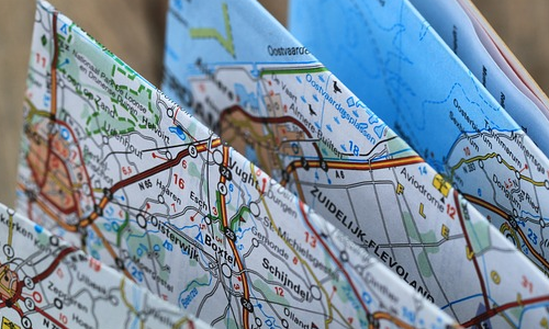
Traveling to some far distant city, state, or country can happen in a whirlwind that leaves you breathless and wanting to go back immediately. There were so many things left undone and places unexplored. You try to take some of the magic back home with you in the form of souvenirs and photographs, but there is something missing. You need some representation of the place itself – a map. Looking at a map, you can remember where you traveled, the routes you took, and the landmarks seen. Why not transform your excitement for those fond memories into an art project?


A map monogram is the perfect way to share your adventurous spirit with all those who enter your home, office, etc. For this DIY project, you will need a monogram, a printed map of the chosen location, paint, scissors, glue, and painter’s tape.


  1. Gathering Supplies

The supplies needed for this project are not difficult to find. Most of them are available at your local arts and crafts store, if not your home.

  • The monogram should be a 3D foam, wood, or board cutout of the first letter of your name. (If you want, you could create a series of map letters to spell out your name.)
  • Paint can be any color and medium type from house paint to acrylics. Be sure to inquire to a salesperson if the paint will apply to the material of the monogram, or test it out yourself on a similar material.
  • The map may need to be printed off of a larger digital printer than what you may have at home, depending on the size of the monogram. It should be large enough to cover the entire letter.


  1. Painting the Monogram

You need not paint the entire monogram, only the sides of the letter. The map will cover the entire face. For something a little more complex, you can add horizontal or diagonal stripes to the sides of the monogram. Accomplish this by laying painter’s tape across the monogram prior to painting. When the paint is dry and the tape is removed, there will be a pattern of alternating white and colored stripes.


  1. Preparing the Map

If you have traveled to the location on your chosen map, you can personalize it with stars, stickers, highlights of the routes taken, etc.


Lay the map face down on a flat surface. Set the monogram face down on top of it. Is there a certain part of the map you definitely want showcased on the letter? Make sure the monogram covers it. Remember, the monogram does not need to be centered over the map.


Trace around the edges (and inside edges) of the letter. Cut out your traced map piece and make sure it matches the monogram.


  1. Adding the Map to the Monogram

Apply glue or spray adhesive over the face of the monogram, being careful not to expose the painted sides. Gently lower the map piece onto the glued face of the letter and, when it is centered, press down firmly. Allow to dry.


A map monogram is a unique way to commemorate a fun travel experience; it’s like transferring part of your scrapbook to a wall of your home. Adding some photos to the same wall can enhance the story told by your art project. Of course, those photographs will need great frames to accent your piece, so bring them into Frame Warehouse to find the perfect fit!